Kurrency Kidz Inc.
Project Overview & Strategic Objective
Kurrency Kidz Inc. required a comprehensive brand identity that aligned with its mission of empowering youth through financial literacy, leadership, and entrepreneurship. The primary design challenge was demographic targeting: creating a cohesive visual asset system that was engaging and relatable to a broad youth audience (ages 3–21) while simultaneously establishing credibility and trust with their guardians.
The Process - Development & Visual Strategy
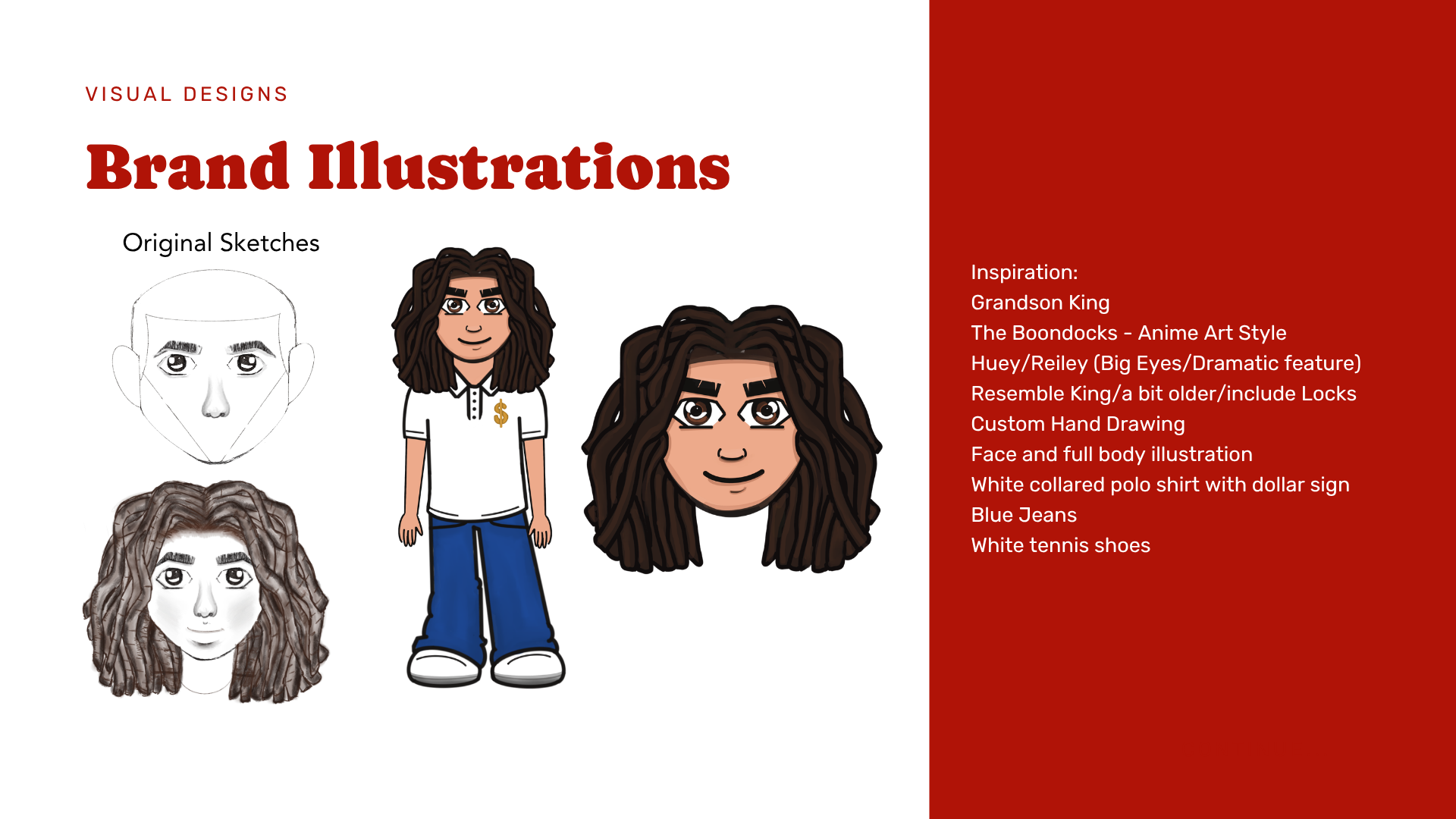
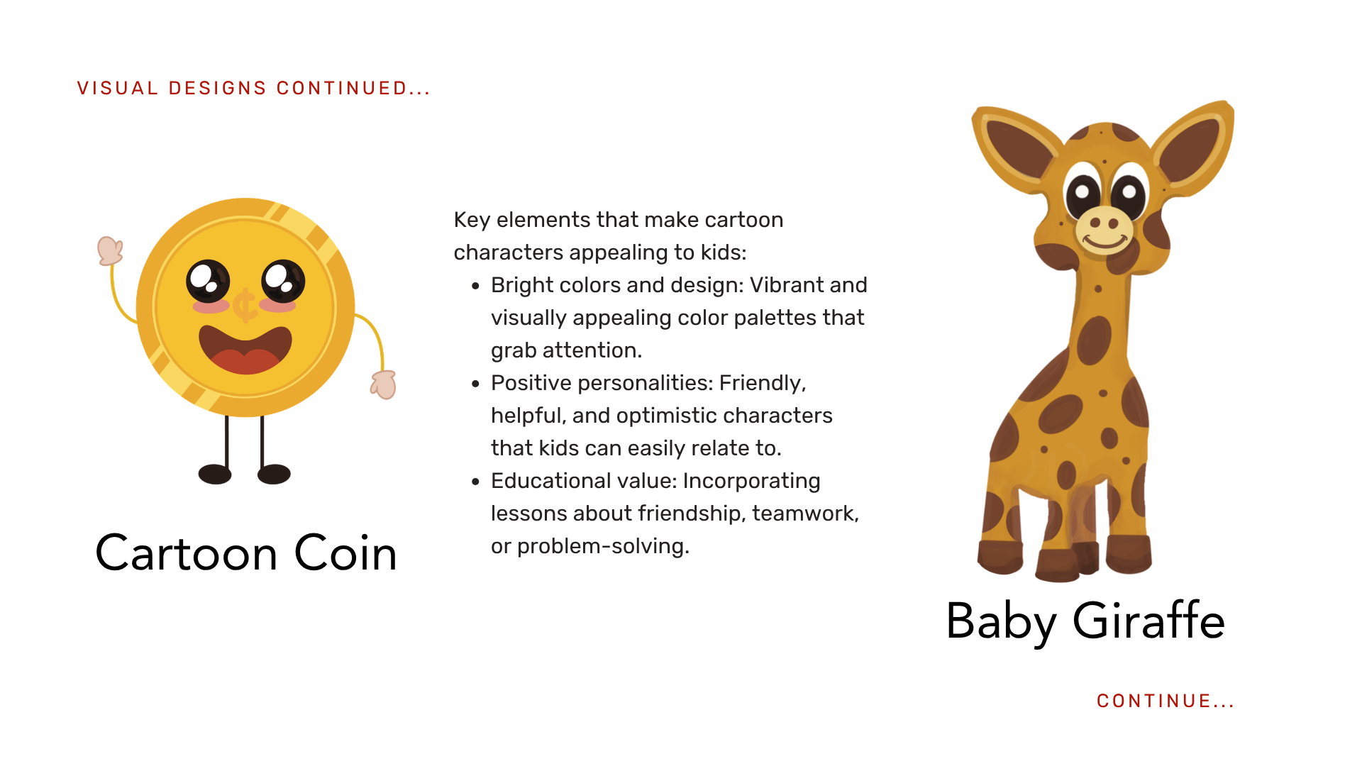
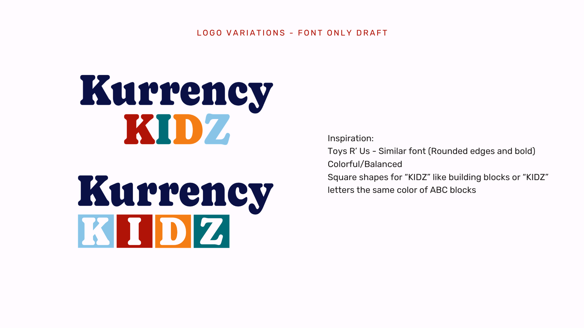
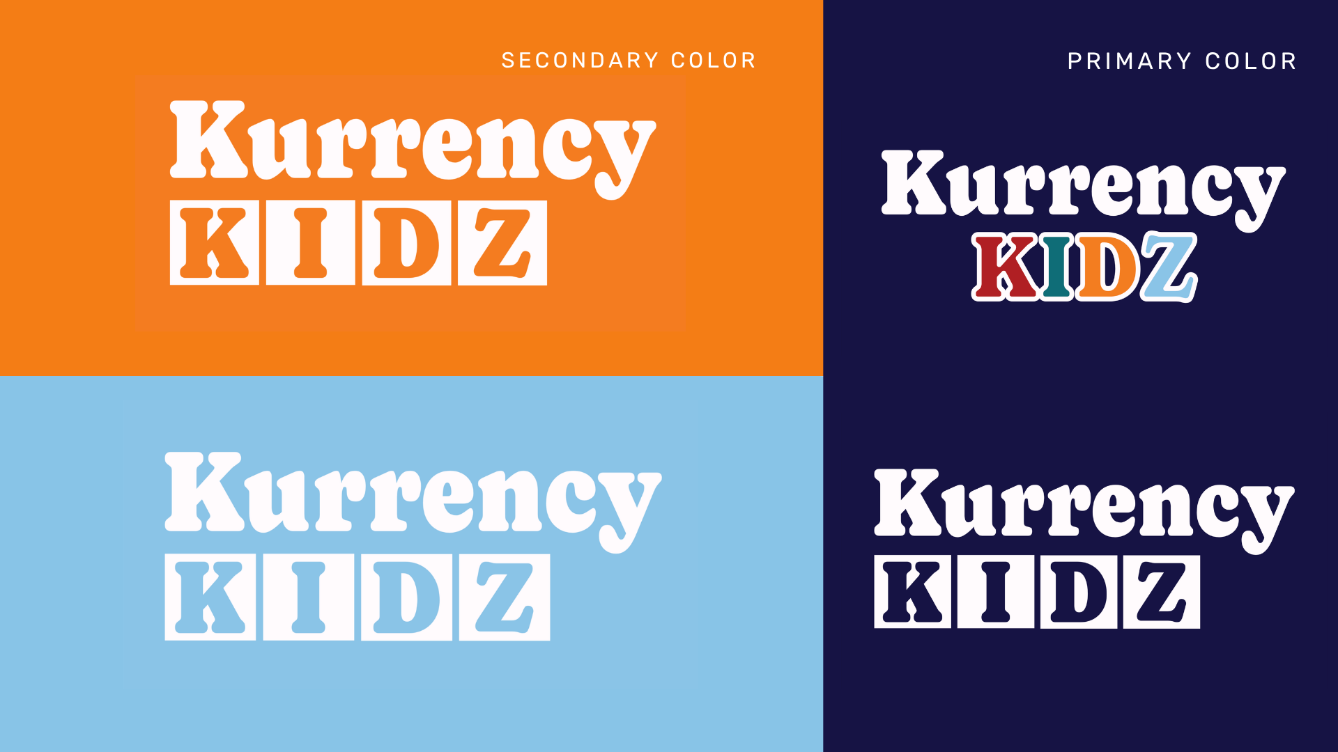
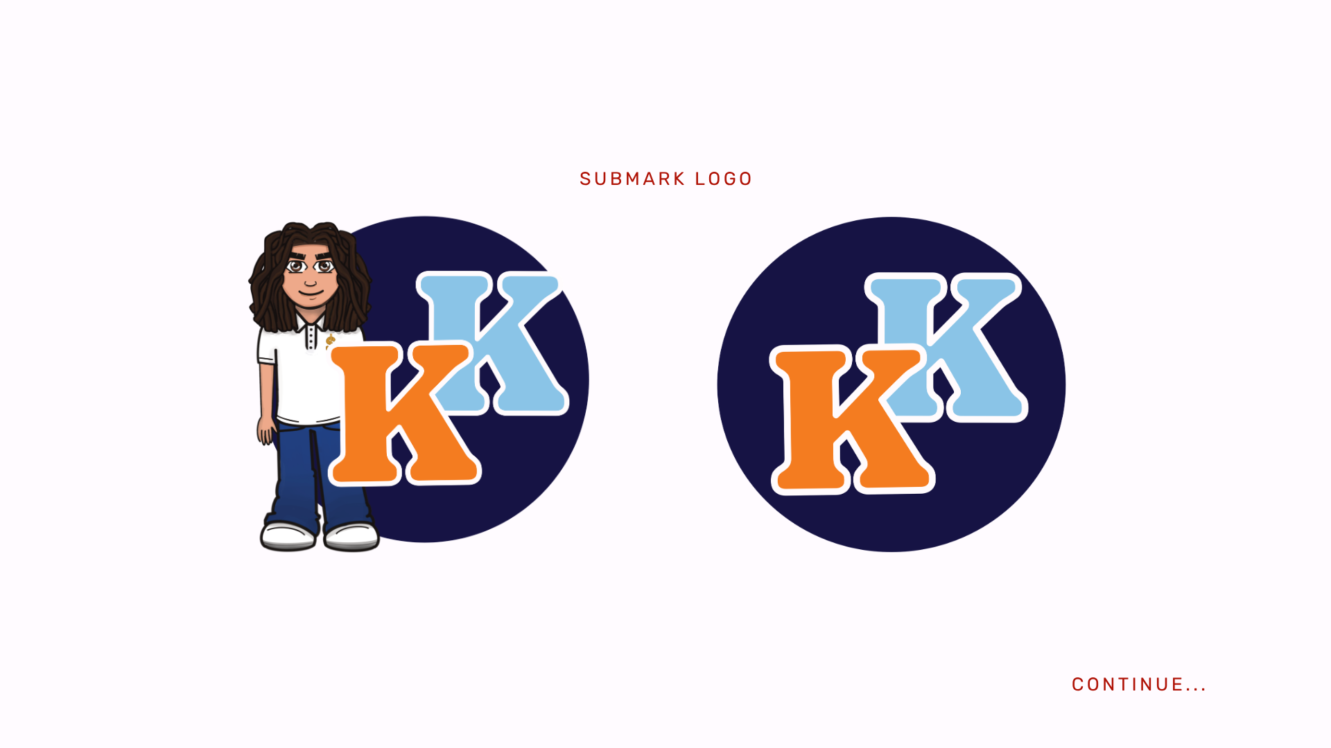
To bridge the gap between education and entertainment, I engineered a playful, nostalgic visual direction inspired by classic youth brands. During the ideation phase, I developed a unique hybrid illustration style—combining a character influenced by contemporary animation aesthetics with approachable mascot design. This strategic blend of colorful, lively imagery functions as a tool for user engagement, stripping away the intimidation of financial concepts and transforming them into an accessible, rewarding learning experience.
The Solution - Market Impact & Brand Performance
The final design system was engineered with a focus on long-term scalability and strategic market entry. By translating complex concepts into an accessible, youth-friendly asset framework, the new visual identity is optimized to lower the barrier to entry for financial education from the moment of launch. The cohesive brand execution serves as a functional toolkit designed to drive immediate user engagement, build family trust, and establish a strong foundation for future audience expansion and community impact.